2011
“Small-Format Portraiture in Engraving and the Bookplate” /article/
The Informational Art-Historical Journal “Chronograph,” Issue 14, pp. 47-68
Vologda. Published by “VOKG”
2012-2013
“Small-Format Portraiture in Engraving and the Bookplate” /article/
“Russian Bookplate Journal,” Issue 14, pp. 63-72
Moscow. Published by “RAE and MSK”
This article aims to demonstrate the development of the portrait bookplate.
When considering the theme of portraiture within the broad spectrum of the bookplate, it is necessary to analyse the portrait canon, study the work of masters of miniature portrait engraving from a historical perspective and the work of contemporary masters of this genre, as well as trace the development of portrait imagery in the modern bookplate.
What is a portrait?
In the visual arts, the portrait is an independent genre whose purpose is to depict the visual characteristics of the model. A portrait depicts a person’s outward appearance and, through it, the inner world of that particular individual.
A portrait is the reproduction of a living face in plastic form and, at the same time, its artistic interpretation.
The word derives from the French portrait (Old French portraire) - “to reproduce something feature by feature” - and means the depiction or description of a person by artistic means such as painting, drawing, engraving, sculpture and photography; literature also has the verbal portrait.
In portraiture, all manner of liberties and deviations, sometimes presented as refinement of taste and creative exploration, are less permissible than in other genres. It is an indisputable fact that in the twentieth century, with the advent of the era of non-figurative art, the portrait genre entered a period of decline. For the most part, works ceased to meet the requirements of genuine portraiture in the sense that had been attributed to this concept over the centuries.
The function of the portrait
The depiction of a character’s appearance is the only means of constructing an artistic image of a person in the visual arts. A portrait may be considered entirely satisfactory when it reproduces the original accurately, with all the features of the person’s outward appearance and inner individual character. Meeting these requirements belongs to the range of tasks of art and may lead to highly artistic results when undertaken by gifted artists capable of investing their talent, skill and taste in the reproduction of reality. Resemblance in a portrait results not only from the accurate rendering of the subject’s outward appearance, but also from revealing the person’s spiritual world and the individual qualities inherent in that person as a representative of a particular historical era and social environment.
In the visual arts, the portrait is important not only in a public capacity, but also in a private, familial one. Through resemblance, it may claim historical authenticity, presenting a visually comprehensible chronicle and serving as a bearer of family likeness. Thus, a distinction is made between external resemblance, which has value as a historical document or family relic, and internal, aesthetic resemblance, which convinces us that this is precisely how the person portrayed should be.
Subgenres of portraiture
A historical portrait depicts a figure from the past and is created from recollections or the artist’s imagination, on the basis of supplementary material (literary and artistic, documentary, etc.).
A posthumous (retrospective) portrait is created after the subject’s death from lifetime images, or may even be entirely imaginary.
A portrait-painting - the person portrayed is presented in a semantic and narrative relationship with the surrounding world of objects, nature, architectural motifs and other people (the latter constituting a group portrait).
A portrait-type - a composite image structurally close to a portrait.
A portrait in costume - a person is represented as an allegorical, mythological, historical, theatrical or literary character.
The self-portrait is customarily distinguished as a separate subgenre.
Genre portrait
Family portrait
Visual characteristics of the portrait in the visual arts
by composition
The compositional invariant of the portrait is a construction in which the model’s face occupies the centre of the composition and the focus of the viewer’s perception. Historical canons in the field of portrait composition prescribe a particular treatment of the face’s central position in relation to the pose, clothing, surroundings, background, etc. by format:
head-and-shoulders
bust-length
waist-length
hip-length
knee-length
full-length
by the turn of the head:
full face (Fr. en face, “from the front”)
quarter turn (to the right or left)
half turn
three-quarter view (Fr. en trois quarts)
profile.
The profile portrait is one of the oldest forms, since its creation required less drawing skill: in some cases, the person was drawn not from life but through an illuminated translucent screen on which the outline of the silhouette was traced:
rectangular format
vertical format - the most popular of the formats
horizontal format
oval format - appears at a mature stage in the development of the portrait genre. Being refined, it enhances the decorative function of the portrait.
circular
square (rarely encountered).
Technique
The technique in which a portrait is executed is one of the important factors influencing the character of the resulting portrait. A small-format portrait executed as an engraving appears to be a more intimate genre. Engraving was often used to reproduce well-known painted portraits.
We owe the emergence of narrative and thematic bookplates to the great German masters of the sixteenth century Albrecht Dürer, Lucas Cranach and Hans Holbein, and to the seventeenth-century Dutch artist and etcher Rembrandt Harmenszoon van Rijn. They were the first to turn to the engraved portrait miniature.
A portrait miniature - a small-format portrait (up to 20 cm) - is distinguished by particular delicacy, a distinctive technique of execution and the use of means inherent exclusively in this visual form. The types and forms of miniatures are highly diverse; they are executed using different engraving techniques, different papers and special inks.
In accordance with the author’s compositional solution (or the customer’s wishes), the image may be inscribed within any format. A miniature executed in the technique of burin engraving is considered the classical portrait miniature. A miniature portrait may be intimate or ceremonial and may or may not have a narrative basis. As in a large portrait, the depicted face may be placed against a neutral or landscape background, or within an interior. Although the miniature portrait is subject to the same basic patterns of development and the same aesthetic canons as the portrait genre as a whole, it differs from it both in the essence of its artistic solution and in its field of application - the miniature is always more intimate in character.
Portraiture has always been and remains one of the principal themes in the visual arts. Artists frequently turn to portrait imagery, for it is not only a highly sought-after and greatly valued genre, but also a particularly interesting opportunity to study the physical and, especially, the psychological essence of the human being.
In the nineteenth century, such portraits became part of the interior: in studies, drawing rooms and libraries, framed miniatures were placed on tables or hung on walls. A wall was often filled with rows of miniature portraits recalling relatives and loved ones.
An artistic portrait is, in essence, a composite image conveying a person’s character, emotions and inner world. Therefore, before executing a portrait, the artist selects the most suitable photograph, or several of them. It is extremely important for the author of a portrait to obtain as much information as possible in order to reveal the depicted person as fully as possible.
So-called “portraits from photographs” are not regarded by art historians as genuine portraits, since without the subject posing it is impossible to create a truly valuable work of art in the portrait genre. They do not count portraits based on reproductions among them, because invention and misinterpretation become mixed into such images. Usually, they are merely mechanical reproductions of facial features without conveying the model’s character. What, then, can be said of memorial portraits?!
A technically complex portrait miniature may be executed in various graphic techniques and is accessible only to selected engravers. The circle of customers for such portraits is very limited. The technique of the portrait miniature is characteristic solely of this genre: burin engravings require filigree cutting, while etched portraits are executed with the finest stippling (pointillé) - tiny dots or short strokes that form the image. The background and costumes are often developed with broader, freer strokes.
Masters
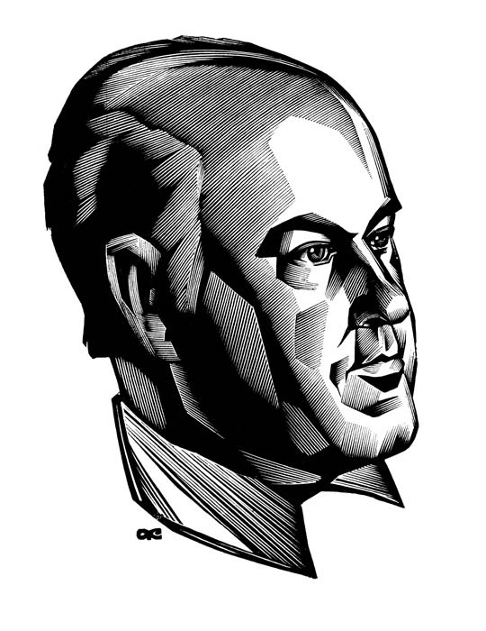
I would like to discuss in greater detail two contemporary artists of portrait miniatures who are also masters of the artistic portrait bookplate. They are Anatoly Kalashnikov (1930-2007, Russia) and Lembit Lõhmus (born 1947, Estonia).
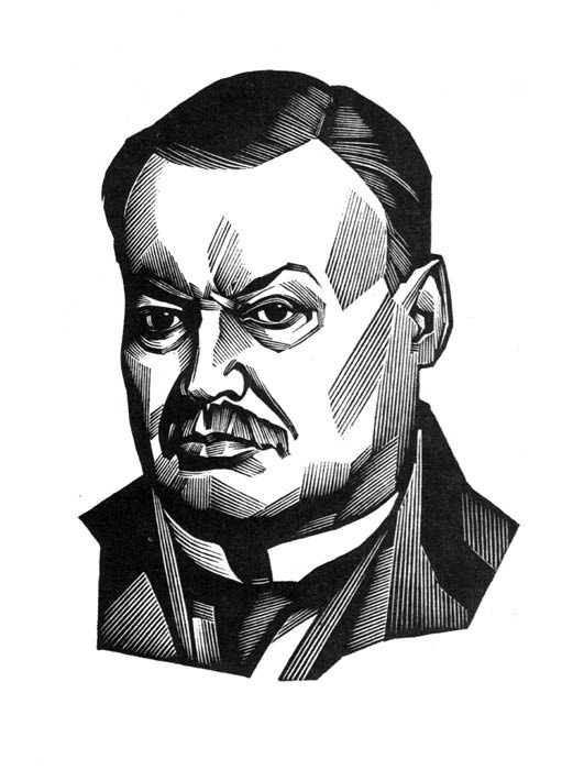
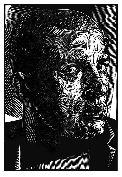
The work of Anatoly Ivanovich Kalashnikov is known to all lovers of small-format graphic art, bookplates and philately. He created more than twenty magnificent memorial portraits. The artist created portraits commissioned by book and music publishers and public organisations, or inspired by his own interest in a particular personality. Portraits of important state and political figures are created to perpetuate the memory of those depicted.
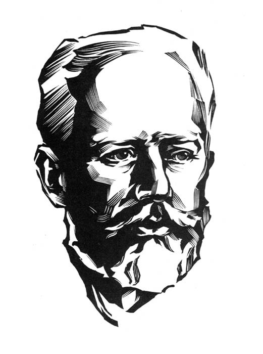
The famous portrait of Pyotr Ilyich Tchaikovsky was created for the International Piano Competition bearing his name. Along with Kalashnikov’s finest works, this portrait constitutes the artist’s true glory. Here, his mastery as a portraitist is manifested to the fullest extent. Tchaikovsky’s portrait is small, but this does not diminish the impression of extraordinary grandeur and monumentality conveyed by the image.
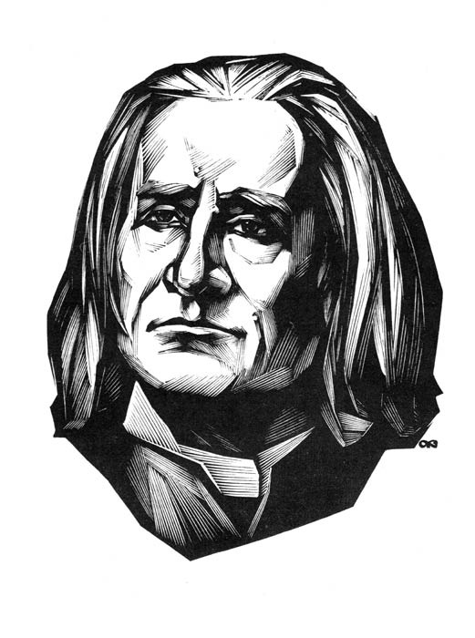
The portraits of Erasmus of Rotterdam, the composers Giuseppe Verdi, Dmitri Shostakovich and Franz Liszt, Omar Khayyam and Mikhail Sholokhov, the chemist Dmitri Mendeleev and the publisher Ivan Sytin preserve the precise composition of the classical portrait: a three-quarter turn, positioning within space, and careful treatment of the face and hands. The author may focus our attention on certain virtuously rendered objects. He may remove the background or make it almost neutral despite its elaboration. Kalashnikov constructs architectonic compositions in his portraits in a solemn “graphic colouring.” He enriches his art with the techniques of monumental painting, translating them into engraving, yet he remains free from adherence to any artistic authority. In all this, the mature mastery of Kalashnikov the portraitist is revealed in its full power.
In the artist’s gallery of portraits, the linear composition is permeated with movement; the lines hardly intersect, break sharply and, executed with varying intensity and force, create tonal relationships and gradations. His art is built upon the contrast of white and black areas so characteristic of graphic works. All this conveys the tense and inwardly dramatic characters of the people portrayed. All the portraits were executed as wood engravings and continue a single representational manner of engraving characteristic solely of A. Kalashnikov.
His portraits appear in architectural or illustrative narratives corresponding to the content being revealed. The artist rarely uses landscape or neutral, solid backgrounds that might distract attention from the portrait image.
Work with supporting material and careful, polished drawing form the foundation of A. Kalashnikov’s portrait art. His attitude towards his models contains no exaggerated feelings or emotions. The author seeks to emphasise the merits and virtues of those he portrays, both external and internal, and to elevate their images. A profound humanity and democratic spirit can be felt in this.
A. Kalashnikov often finds one or two characteristic details whose depiction enhances the characterisation of his models. Created from imagination, they are nevertheless marked by qualities of lifelike persuasiveness. The images are distinguished by particular poetic quality and sublimity. The resemblance and accuracy of the portrayal are evident in every portrait. For each individual, the artist finds an appropriate measure of balance or stability, dynamism or repose. Yet there is always a refined sense of proportion, speaking both of the artist’s highly developed sensitivity and professional mastery and of his respectful attitude towards his subjects. Every portrait by A. Kalashnikov breathes with life.
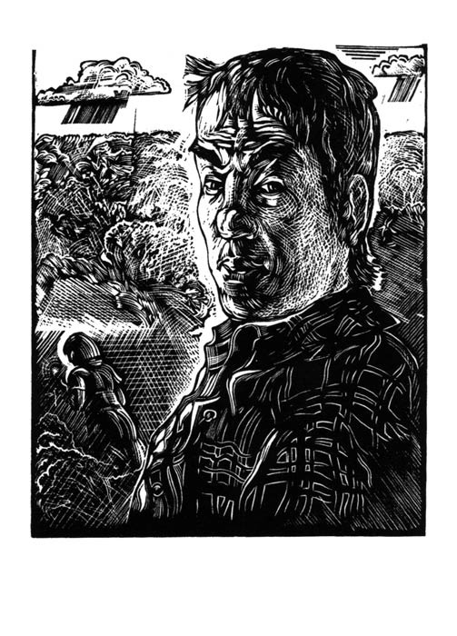
The image in the self-portrait, executed and printed from the artist’s own block as the frontispiece to the publication “Bookplates of Anatoly Ivanovich Kalashnikov” (series “Bookplates by Outstanding Masters of Graphic Art,” Moscow, 1976), is rendered volumetrically and in strong contrast. A later self-portrait, a kind of programmatic work, is treated through soft linear relationships; its tonal development corresponds to the reality surrounding the person portrayed.
The nuances and shades of the model’s inner state are not decisive. It is more important for the artist to convey the graphic state of the image. The white background of the plane does not so much define the image’s boundaries as sharpen and emphasise that which is executed in line.
Anatoly Ivanovich Kalashnikov is a distinguished successor to the narrative and thematic bookplate that appeared in Russia during the second half of the eighteenth century, and belongs to the constellation of successors to the Moscow school of wood engraving alongside such artists as V. Favorsky, A. Kravchenko, P. Pavlinov and others who made an enormous contribution to the art of engraving.
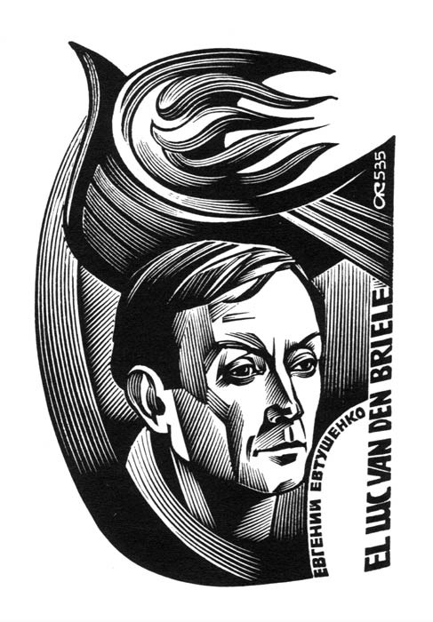
In speaking, in essence, of A. Kalashnikov’s gallery of portrait bookplates, we must not forget the enormous number of portraits he developed for postage stamps, where his style as a reproductive artist of the Pavlovsk school was honed in a special way. These include the portrait of Mussorgsky in Gennady Rozhdestvensky’s bookplate, the portrait of Yevgeny Yevtushenko in Luc van den Briele’s bookplate, and the image of Rudolf Steiner in G. Strobel’s bookplate.
The artist constructs his bookplate compositions concisely and consistently, always revealing the complexity of the image in an unexpected way. He is a master at revealing the depth and breadth of an inner theme. Despite their small format, the inner scale of the images created by the artist is akin to monumental art. The images in A. Kalashnikov’s book miniatures are synthetic and multifaceted; they arise from an organic combination of different associations. With restrained artistic means, the artist convincingly conveys character.
The concentrated facial expression and setting in the portrait bookplate emphasise the richness of the subject’s spiritual world. In his compositions, the artist generally turns the model’s face three-quarters towards the viewer, which slightly softens the impression but does not embellish the expression. The carefully developed boundaries of light and shadow attract the viewer’s attention and complete the inner characterisation of the portrait image.
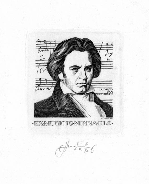
The Estonian engraver Lembit Lõhmus made an enormous contribution to the art of small-format portraiture. In comparison with the art of A. Kalashnikov, L. Lõhmus strives to employ every characteristic of portraiture: by head position - from full face to half turn; by format - from head-and-shoulders to waist-length portraits.
L. Lõhmus’s small-format portraits reveal the extent to which his work was influenced by classical portraiture and where his own independent understanding begins. The artist carefully models faces, hands and clothing, but the details of his modelling do not dissolve into “sfumato”; on the contrary, they emerge clearly and distinctly in relief. Where many graphic artists prefer the mysteries of developing black and white and subtle transitions of light and shadow, L. Lõhmus seeks clear representational solutions, employing a variety of the finest juxtapositions and contrasts. In their compositional solutions, his portraits are endowed with elements of stability, balance and stillness.
In his works, the artist used all the achievements of portrait engraving from different periods. Artistically, his early portraits still largely represented an assimilation of the distinctive features of the portrait art of outstanding predecessors and contemporaries. Later, having absorbed the best of their work and enriched his creative method with it, he developed his own style and artistic manner.
The principal virtue of L. Lõhmus’s portrait art is his ability to convey the image of the model as that person truly is, while remaining within the strict limits of formal mastery and devoting primary attention to the mysteries of professional craftsmanship.
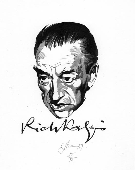
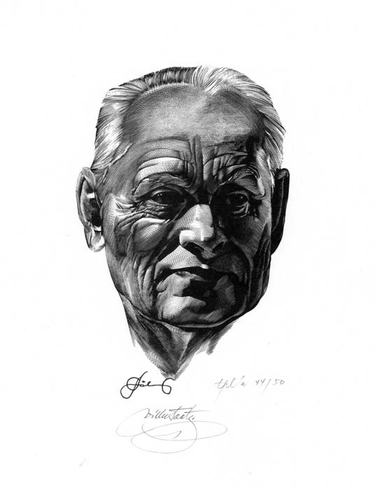
Such is the portrait of his teacher from afar, Wim Zwiers, executed as a burin engraving. The portraits of the renowned calligrapher Villu Toots and the artist Richard Kaljo were executed as wood engravings. From several photographs, L. Lõhmus was able to capture the models’ characters and proved that the result is determined by the artist’s skill. It does not matter whether he sketches from life or uses a photograph. His portraits are distinguished by the pronounced individualisation of their images and the specificity of their external and internal characteristics. The main advantage of this method is that the model does not have to spend time posing, while the image receives an individual interpretation. Although the artistic value of such works is rated poorly by “classical” art historians, the labour involved in producing them in a small format is considerable.
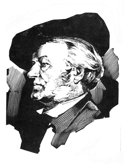
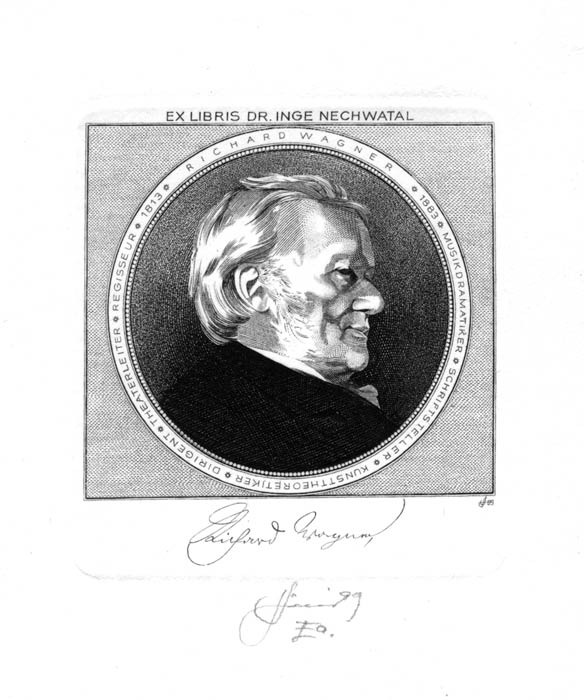
The artist created a large portrait gallery: Richard Wagner, Kristjan Raud, Oskar Luts, a portrait of his father, etc. Despite the evident continuity of creative approach linking these portraits, they possess many differences which, when compared, allow us to understand more clearly the analysis of the subjects and the distinctions among the artistic manners of the engraving techniques employed.
L. Lõhmus’s balanced bookplate portraits, with their calm transitions, differ from the faces in A. Kalashnikov’s bookplates, which are rich in contrasting combinations of light areas and dense dark ones.
In the Estonian graphic artist’s work, the compositions are more frontal and unfold primarily in the foreground. Primary attention is devoted to revealing the inner world of those portrayed. Within a single composition, the artist juxtaposes and combines two different principles: the volumetric and the planar, a meaningful background and a semantic burden.
In his portrait bookplates, the artist clearly expresses emphasis, artistic completeness and constructive precision.
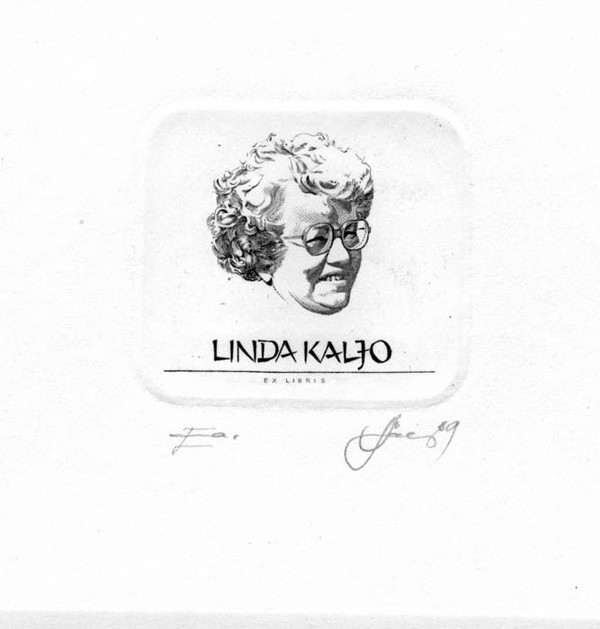
Having perfected his mastery as a portraitist and enriched his works with a variety of artistic techniques, L. Lõhmus helped transform certain portraits in bookplates into historically documentary portraits. These include the bookplates of Mati Metsaviir, created for his anniversary; Linda Kaljo; Boris Levykh; Gerhard Treier; and the bookplate featuring Tilman Riemenschneider.
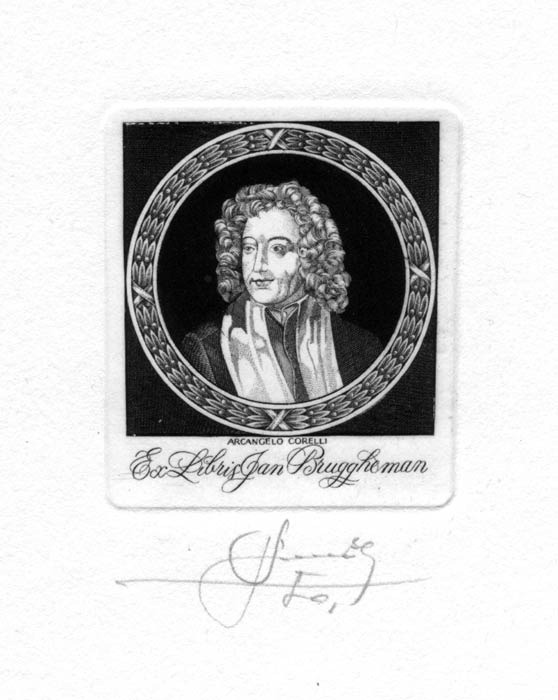
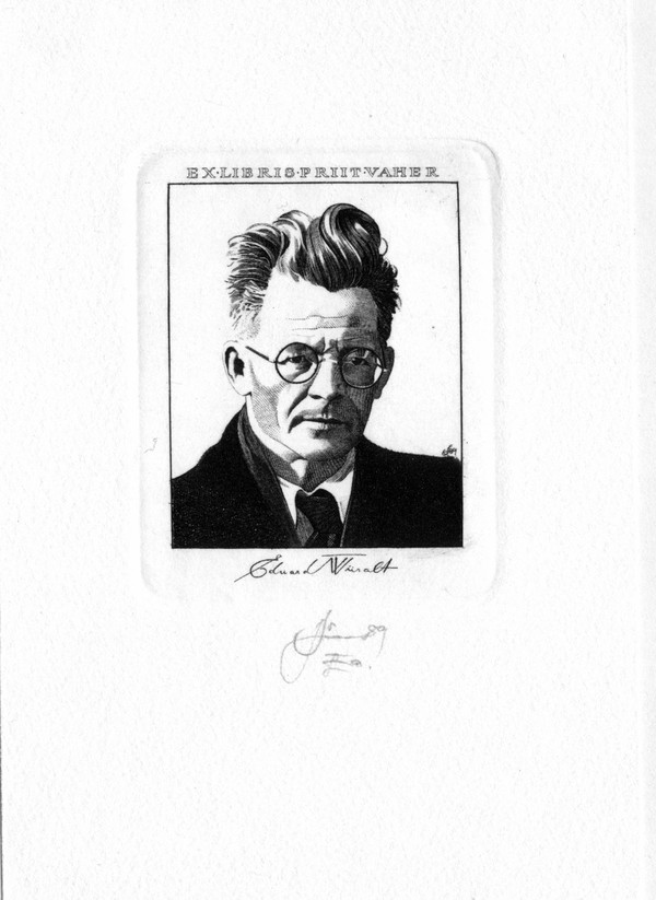
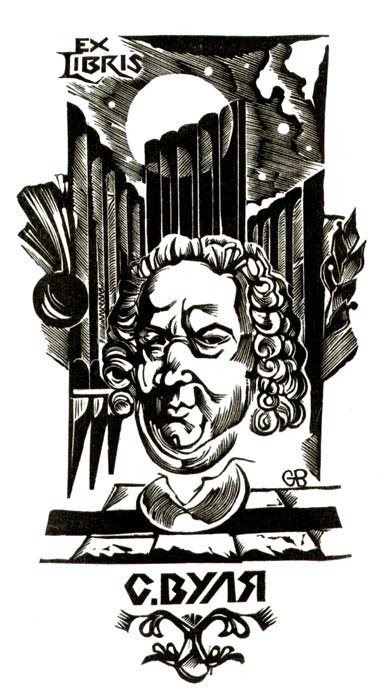
The portraits in the bookplates of A. Hausweiler, H. Lepik, J. Brüggemann and P. Vaher are interesting because in them the artist appears to synthesise all his technical developments, combining the individual portrait with plastic and decorative techniques. The composition of each bookplate is carefully considered and developed with talented subtlety, then executed with jeweller-like mastery. The principal expressive means in most of them is tonal modelling, which is generally unrelated to the characteristics of any specific lighting. Linear tone constructs the image and bears the principal emotional burden. It is important for the artist to express the portrait characteristics by any means and to emphasise the lyrical aspect. A typeface introduced with great tact imparts a sense of completeness. The typeface in A. Kalashnikov’s bookplates is uniform; it was discovered once and then refined throughout the artist’s work. L. Lõhmus’s typeface is highly flexible and modelled according to the person depicted.
Each of these artist-engravers made a major contribution to the advancement of portraiture in small-format graphic art. The portrait galleries they created of cultural figures and private individuals are of indisputable artistic value, through which the creative method may be studied and enriched and the artistic manner and style analysed.
Small-format portraiture in the work of Moldavian artists.
In Moldavia, the small-format engraved portrait, as a form of small graphic art, developed and became widespread during the 1960s. This phenomenon was associated with the rapid development of book printing and the rising standard of book illustration in the republic. At that time, a collective of professional graphic artists with specialised training in book illustration was formed in the republic. Book publishing broadened the range of creative aspirations and increased interest in comprehending figurative and plastic solutions. Distinctive creative personalities emerged, capable of introducing their own vision into the genre portrait, the illustrative portrait and the portrait bookplate.
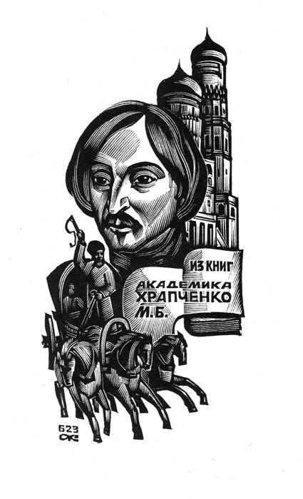
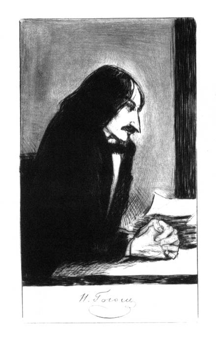
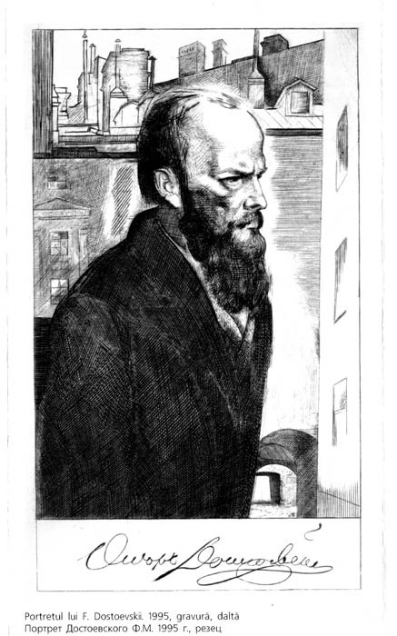
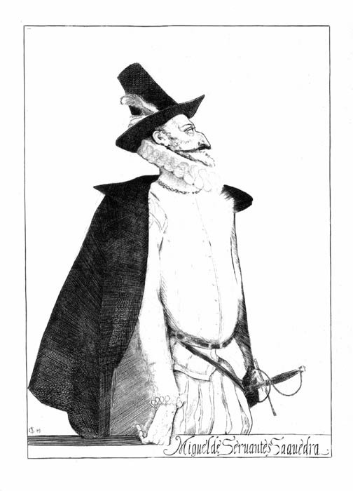
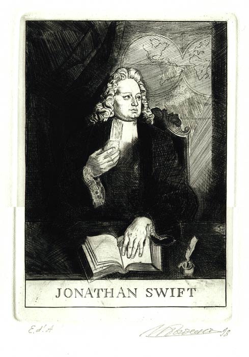
A master of book art and an academician, Ilya Trofimovich Bogdesko created an entire gallery of portraits of classics of world literature. These include Jonathan Swift and Erasmus of Rotterdam, Miguel de Cervantes and Milescu Spătaru, Nikolai Vasilyevich Gogol and Fyodor Mikhailovich Dostoevsky. The portraits from I. Bogdesko’s artistic laboratory provide an idea of the scope of the master’s creative aspirations, the range of his explorations and his free command of engraving techniques.
J. Swift’s novel “Travels into Several Remote Nations of the World by Lemuel Gulliver, First a Surgeon, and Then a Captain of Several Ships” belongs among the greatest works of satirical literature in the world. The clarity of I. Bogdesko’s style and creative approach were manifested to the greatest degree in the portrait of the great satirist and humanist on the book’s frontispiece. The portrait of Jonathan Swift (1998) is a classical historical portrait recreated by the master from imagination on the basis of literary and artistic material. In accordance with the historical canon, the person portrayed is presented in a narrative relationship with the surrounding world of necessary objects: a book, map, pen and inkwell. The motif prescribes a particular interpretation. The composition is presented as a theatrical historical interior. The figurative and artistic structure of J. Swift’s portrait is subordinated to the reflection of the principal narrative and semantic lines of this satirical novel. The realistic portrait of the author is constructed in contrast to the satirical illustrations, which at times develop into grotesque imagery. I. Bogdesko fully displays the merits of his talent as a draughtsman, using the diverse representational techniques of burin engraving on copper in all its brilliance and beauty.
The portrait of Erasmus of Rotterdam, the outstanding medieval educator and humanist, created for “In Praise of Folly,” was executed in 1979. Here too, continuing and deepening the tradition of revealing the artistic image, I. Bogdesko once again distinguished himself as an artist and thinker. The portrait of Erasmus is magnificent: before us stand a sage, a thinker and a wily observer. An ironic smile barely touches his lips; behind it lie understanding and all-seeing insight. Erasmus philosophically observes the grimaces and leaps of universal folly in order to reveal them to the world. The artist succeeded in conveying the principal, defining characteristics of Erasmus of Rotterdam: his immense intellect and strength of spirit. The portrait is contemporary and, at the same time, the author “throws a bridge across time,” connecting us with the drawings and engravings of Erasmus’s contemporaries. The graphic artist I. Bogdesko reproduces the characteristic techniques of burin engraving of that period. The atmosphere of the era is created not only by the portrait but also by the entire composition, carefully conceived and just as carefully executed by the artist.
In the portrait of Miguel de Cervantes (1996), the artist’s choice of composition remains precise, painstaking and wholly subordinated to the semantic revelation of the writer’s image rather than to external entertainment. The construction of the figure, the gaze, the position of the hand, the interaction of the white background with the incised black lines, as well as the engraved handwritten typeface unobtrusively complementing the portrait, introduce us to a particular historical time, to the portrait
“of that era.” The artist’s burin manner sounds ever more assured, expressive and rigorous. All these qualities visibly shift the centre of gravity of the portrait from the purely visual and illustrative sphere to the psychological and emotional. I. Bogdesko uses the pure language of burin engraving on copper, rich in artistic possibilities and graphic precision.
The graphic manner and tone become more complex in the portrait of Nikolai Vasilyevich Gogol (1995). Yet in this engraving too, I. Bogdesko’s principle of visual composition remains unchanged. Despite the artist’s extremely broad technical potential, the stylistics of his visual interpretation are always the same - restrained. The writer Gogol appears before us in a tense, contemplative state. The absence of any details brings us into a state of concentration upon the subject and enables us to understand the depicted image more acutely.
It is also noteworthy that in the portrait of Fyodor Mikhailovich Dostoevsky (1995), I. Bogdesko devotes considerable attention to depicting the surrounding material environment, focusing attention on urban architecture. This enables the artist to reveal the semantic subtext more fully and to introduce a particular emotional nuance into the portrait’s figurative structure. Dostoevsky “exists” within the characteristic environment inhabited by his heroes. The uniformly tapering ends of the engraved lines, the frequency of the strokes and the “silvery sheen” - all these are features of classical burin engraving.
A vertical compositional format is traditionally employed in the portrait of Milescu Spătaru (executed in 1998). The completed half-length figure of the public figure creates a sense of “easel art” and the intonation of the era. The image is placed within a stylised plastic environment and visually connected with the unobtrusively accompanying text “Milescu Spătarul.” The drawing is meticulously refined and endowed with a historical characterisation of its subject.
The engraving is distinguished by the absence of the classical “silvery sheen” produced by engraved “burrs” and “straws” not removed with a scraper. This creates the impression that the portrait was executed in the “drypoint” technique.
Leonid Stepanovich Nikitin made a substantial contribution to small-format portraiture. The artist organically joined the broad current of “young graphic art” of the 1960s, a current fascinated by linocut and plastic. He found his own path, his own “graphic voice” and “intonation.” The realisation of personal rather than borrowed creative experience acquired particular value for the artist. Hence the strengthening of the personal principle in portrait engraving. In his works, the artist demonstrated concision in a strictly “black-and-white manner,” and the energy of sharply cut forms and strokes that conveyed the distinctive monumentality of the reality and modernity of that time.
While working on illustrations for V. Ruzhina’s “Jealous of Copernicus” (1970), L. Nikitin created a portrait of Vladimir Mayakovsky for the book’s cover. The refined elegance of the rhythmic combinations, the linear tone and the conspicuous virtuosity of the portrait executed on organic glass appear unconvincing in relation to Vladimir Mayakovsky’s creative style and his complex and, above all, serious attitude towards the processes then taking place in the world. Dissatisfaction with this discrepancy compelled the artist Nikitin to create a new portrait of the poet of the Revolution in 1976, which he accomplished with great success.
In almost all the portraits executed during the 1980s, the predominance of formal graphic art can be felt, along with the engraver’s culture and high qualifications.
In 1981, he created a large cycle of portraits entitled “European Enlighteners.” These are portraits of Antonio Labriola, August Bebel, Franz Mehring and Ivan Lopatin. All these portraits are united by their manner of execution, the semantic and graphic structure of their images, the compositional concentration and, at times, monumentality. By artistically shaping the “incompleteness” of certain graphic portraits, Nikitin achieves the most expressive form, an expressive line producing a subtle, characteristic outline and enriching the work as a whole, giving the portraits greater individuality. Having executed a large number of so-called “portrait redrawings” for engraving and possessing an understanding of the possibilities of the portrait genre, the artist works on “imaginary portraits” with particular responsibility and dedication. Each of his portraits is a psychological study, a discovery achieved through prolonged, painstaking labour. Such are the portraits of Dimitrie Cantemir, Mihai Kogălniceanu and Alexander Herzen.
The work of the artist Nikitin was manifested with particular brilliance in the series of portraits “Russian Cultural Figures”: Mikhail Lomonosov, Antiochus Cantemir and Ivan Volkov (1982). It is difficult not to agree with his engraved interpretation and the atmosphere in which L. Nikitin’s portraits “live.” The tendency of execution and the integrity of the series’ figurative construction, as well as the manner in which the engraving formats are organised, are clearly visible. If the influence of the Moscow school of engraving cannot be felt in these developments, then at least a consonance with it is evident.
The portrait of his wife and the self-portrait are constructed upon plastic contrasts. They affect the viewer primarily and directly through associations, the literary ideas embedded in them and a particular graphic style. Despite their considerable tonal contrasts, they prove insufficiently active for perception and the related interpretation of the work. This refers to the psychological characterisation of the spouses. Plastically, the composition is perceived not as an inner struggle between two individuals, but merely as a decorative approach. The portrait of his wife Valentina is typical of the flourishing period of the artist’s work and is probably connected with his fascination with the art of V. Favorsky. The female portrait (there are several, created in different years) clearly demonstrates the master’s emotional and creative disposition.
Success comes to Leonid Nikitin when he encounters a theme corresponding to his already established system of artistic thought and representational techniques.
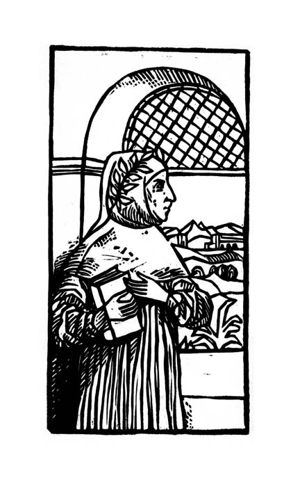
In the 1980s, the artist Isai Grigoryevich Cârmu was engaged by the “Cartea Moldovenească” publishing house to illustrate and design works by classics of world literature (Petrarch, Sebastian Brant and Pablo Neruda). Working with literary material, he found his own individual approach to illustrating these works through relief wood engraving. Three portraits of writers for Petrarch’s “Lyric Poetry” (1980), Sebastian Brant’s “The Ship of Fools” (1979) and
Pablo Neruda’s “Poetry” (1981) were executed in the classical manner of wood engraving. The portrait of Petrarch created by Isai Cârmu is the only portrait of the poet executed by Moldavian graphic artists. Before the viewer appears the restrained and majestic image of the Renaissance. The artist succeeded exceptionally well in his artistic device: he does not bring the poet closer to us but, on the contrary, uses graphic means to bring us closer to him. Printed on paper seemingly yellowed with age, the portrait uniquely reveals to us the world contemporary with Petrarch. Before our eyes, the artist “engraves” the time that gave birth to the great poet.
We undertake an equally fascinating journey into another era in the book featuring the portrait of S. Brant, “The Ship of Fools.” This is a historical waist-length portrait in which the artist depicts the author reading a work of literature; however, its visual point of departure is the grotesque.
The cycle of engravings for Pablo Neruda’s book “Canto General” shows us that Isai Cârmu is a master of comprehending the tragic. Although the poet is a representative of twentieth-century literature, the artist once again selects relief wood engraving and a single black ink from his entire illustrative arsenal. For him, this colour seems to predetermine a feeling of sorrow. The portrait is executed in profile and resembles a memorial plaque bearing dates and text from the poet’s work.
I. Cârmu’s portrait works are examples of rigorous constructive solutions determined by the chosen manner, the ability to work in an “engraved-out” tone, in black-and-white engraving, and with a precisely selected stroke. He does not lead the viewer into the realm of purely formal creativity or ornamentation. This is prevented by an awareness of the portrait’s functional qualities and the creation of an image. The artist left a highly significant mark on Moldavian xylographic illustration of the late 1980s.
Vadim Eduardovich Ryaboy introduced a uniquely individual manner of portraiture in the bookplate into the Moldavian school of bookplate art. His bookplates were executed predominantly in etching techniques (etched line, mezzotint, aquatint and drypoint). He found an individual nuance of vision, whether in a self-portrait or a portrait of his wife and daughter. Objectively, his engravings do not address the psychological theme in portraiture. The graphic artist conveys images as they are at the moment of depiction, while remaining within the framework of artistic creation and devoting primary attention to professional mastery.
The miniature dedicated to his little daughter Ksyusha (1980), executed in the “etching” technique, was created with particular feeling. Resemblance and precision of depiction can be felt in the portrait. The child’s face reflects a state of tranquillity and contemplation. Compositionally, the artist finds the measure of the subject’s equilibrium and disrupts this state with a constructive and expressive element - the inscription “Ksyusha’s,” executed on a second plate. The miniature is rich in tonal hatching and the expressiveness of a free line.
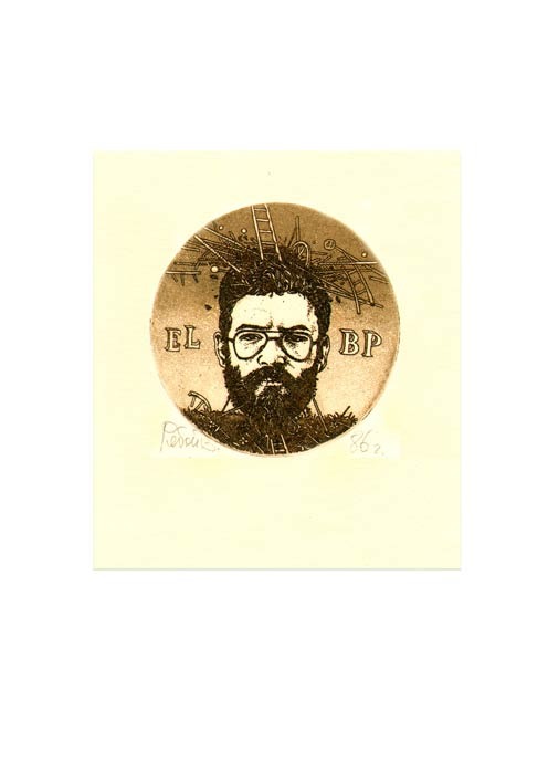
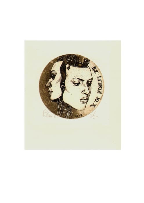
The narrative character of the portraits, the conventionality of the means of artistic expression and metaphor intertwine in a diptych executed in 1986 for his wife, Yulia Katalnikova (designated YuK), and for the author himself (designated VR). The images were executed on round zinc plates with a surrealistic interpretation and the use of the “aquatint” technique. It was precisely in these works that the author revealed the artistic structure of his art and formulated an independent concept for his subsequent work. In these bookplates, V. Ryaboy successfully combines portrait imagery and type.
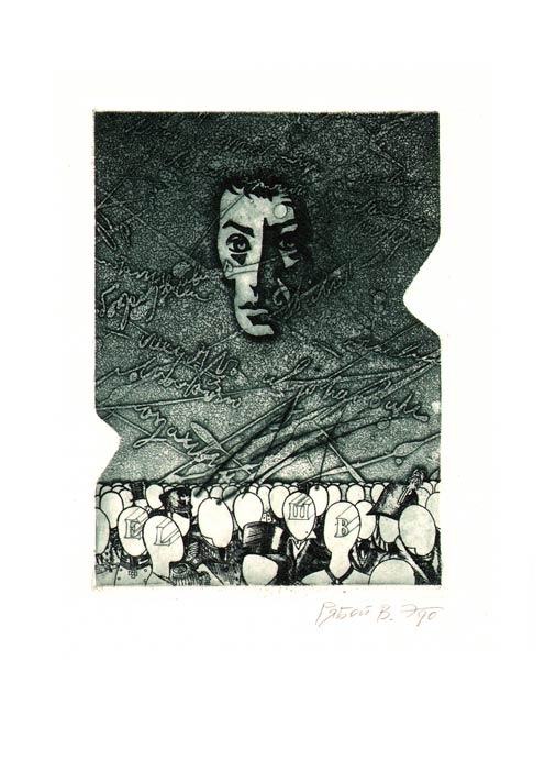
The approach to theme, motif and image proves expressive in the triptych created in 1989 for the Inter-Republican Exhibition-Competition “The Life and Work of Alexander Sergeyevich Pushkin.” Maintaining a common stylistic character and depicting portraits of the poet in his youth, in maturity and as the genius’s death mask, the artist found a poetic antithesis, the principal visual device: “people, admirers and bard.” This device made it possible to discover expressive compositions uniting capacious symbolic images of time. A highly selective path towards the theme, semantic multiplicity and portrait significance can be discerned. The engraver feels free and spontaneous and employs the plastic and technical techniques of engraving with ease. Executed in open biting combined with the rich intonation of the line, the bookplates are decorative in their solution and organic in style. The works contain something special and unique.
In the small-format portrait of his wife, the artist masterfully uses every possibility of “mezzotint,” a technique simple only at first glance, in which expressiveness, richness of tone and the velvety quality of black are by no means easily achieved. In organising the portrait space, the author treats the central position of the head within his composition. Through graphic techniques, he creates the colouring of monumental painting and focuses our attention on certain carefully rendered elements of the face, at times illuminating the background and at others saturating it anew with the intended intensity of black. In this work, V. Ryaboy immerses the viewer in the sensual reality of the portrait, transforming the viewer into a participant in the creative process.
The artist enriches his technically complex portrait miniatures with diverse techniques and frees them from adherence to any artistic concepts.
M. Vakarchuk (portrait of Dimitrie Cantemir), M. Gerasimov (portrait of Yemelyan Pugachev), G. Zlobin (portrait of the poet Mihai Eminescu) and A. Usov (portrait of Byron) also turned to the development of the engraved portrait in book illustration. In the bookplate, this was done by E. Epur and V. Herța.
My creative experience in portraiture.
One of my first small-format portraits was executed in the “etching” technique for Bernard Shaw’s collection “Aphorisms” in 1982. For the modern person, an aphorism is a fairly abstract form: it is a phrase floating by itself and serving as a “gift” to the reader. The author’s thoughts, illuminated by the light of spiritual life, would seem to give the graphic artist grounds for a rational “quotation” of what has been expressed, imparting a special, concealed artistry to the refinement of the language. An illustrator working with material of this level inevitably approaches the idea of replacing the metaphor of life with surrealistic meaning. All this could not fail to be reflected in the portrait of B. Shaw, which was executed with photographic precision in an imitative manner that contrasts with the works of the master of aphorisms themselves.
The portraits of Catherine II, Alexander Suvorov and Fyodor Ushakov, executed for the Tiraspol Historical Museum in 1990, were developed differently. The engravings are distinguished by a realistic approach to the model and a quality of being thoroughly “made.” Working on the portraits required dozens of interesting “encounters” with the aforementioned figures.
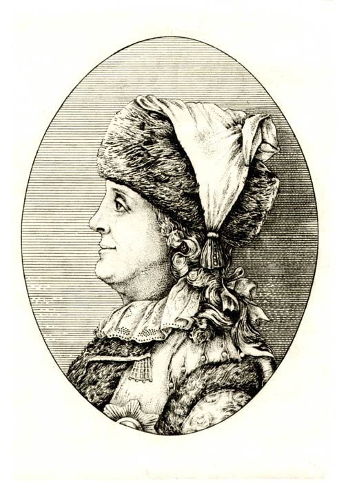
As a rule, the Empress was depicted full face or in three-quarter view. The museum commissioned a historical portrait of Catherine II in profile and executed in the “etching” technique. It was also necessary to resolve the compositional canon in which the model’s face occupies the predominant, central position. The subject’s outline was far from elegiac, and her facial features were far from ideal. Many hours spent studying works by artists who had depicted Catherine prompted me towards creative explorations that meant entering into an intellectual contest with the most fascinating creators of the “Catherinian” era. It was necessary to understand, reveal and accentuate the facets of a great personality. The portrait had to acquire a particular interpretation as a historical figure. A slight smile lent mystery to the image. Material culture reflected the period, while transparent modelling with colour (watercolour over etching) emphasised the femininity of her appearance.
The portrait task in the depiction of Hans Christian Andersen (1990), on the other hand, was constructed according to the principle of telling the story of a man and storyteller within the space inhabited by his characters. The portrait is illustrated, with the subject here understood not as a pretext but as a principle of artistic construction, in which plastic tasks are resolved, the graphic image is varied and narrative richness is created by a multitude of characters from the author’s works. The storyteller’s characters living beside him appear to give material form to the space and “inhabit” it as a home. The portrait narrative is subjected to a “fairy-tale” discipline, which to some extent makes it possible to gather a complex of events from different periods into a single illustration. Here it is appropriate to speak of another principle of perception; let us call it playing at theatre, a world of the old fairy tale in which the mystery and magic of the atmosphere are more captivating than the mischievousness of play. Andersen’s portrait itself seems to constitute the storyteller’s intonation, the storyteller’s home.
It was necessary to treat subtly the “multilayered” nature of illustration in a children’s book. To reflect children’s perception and trustfulness, the sentimentality of adults, the immersion of children and adults in a land of illusions, and the return to childhood. And thus to become an interlocutor for the reader rather than simply someone who had executed a portrait of H. C. Andersen. Rich fairy-tale material always gives the artist grounds for aestheticism and for imparting a festive colouring to events, for a fairy tale is a world that often serves as a pretext for pure improvisation upon a theme. In this portrait-illustration, I attempted to include diverse colour combinations and elements enabling the viewer to take pleasure in examining the engraving closely and in detail, centimetre by centimetre, as its complex direction requires. The etched line, now straight and intermittent, now light and curling, creates images of “Andersenian” characters on the surface of the engraving plate.
I attempted to test all my explorations and graphic discoveries in small forms - bookplates. The works were defined by a carefully considered and predetermined figurative concept. My knowledge and understanding of the art of the bookplate are expressed quite clearly in all my early works. I shall not attempt to conceal the fact that I was fascinated by the work of the old masters of miniature art and, of course, by their “manner” of execution.
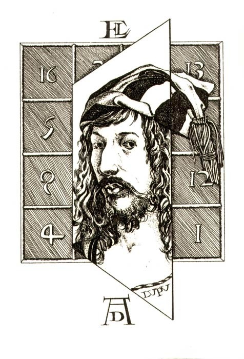
The portrait bookplates of V. Sheiko (1985) and V. Lupu (1985), dedicated to Albrecht Dürer, are functionally conditioned by an entire complex of aesthetic tasks. Depending on the person portrayed, I attempted to vary the degree of depth in the image and the relationship between details within their overall composition; nevertheless, the portraits always had to remain spatially substantial and monumental. Such are the portrait of Emperor Maximilian woven into the monogram AD (Albrecht Dürer), and A. Dürer’s self-portrait against the background of the magic square from his famous engraving “Melencolia.” These are, as it were, “responses” to the works of the German artist. I attempted to endow the developed compositions with qualities characteristic of the great artist’s work. It seems to me that they are sufficiently integral and can withstand considerable enlargement without losing the force of their aesthetic impact.
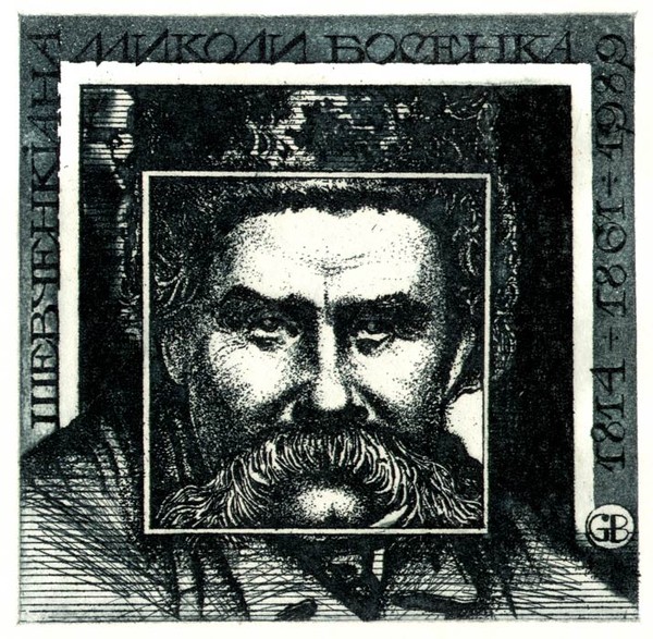
The “direct” approach to the motif and image of Taras Shevchenko’s portrait in Mykola Bosenko’s bookplate (1989) seemed the most expressive to me. In organising the portrait space compositionally, I created a stepped, recessed frame with the image of the poet placed at its centre: this made it possible to subordinate the measure and proportions of the principal constructive rhythms and the movement of the plastic masses to one another.
The miniature executed for Renzo Mancini (1988) was formed according to a different principle. It is a metaphor of complex associative connections: here, as an artist, I sought to “capture” the moment through a certain analytical approach and view of time. The depicted portrait of D’Annunzio “oscillates” between an external recording of the face and a claim to “psychology.” Yet as a whole, the portrait seems to recede into the background (at least temporarily) before the narrative of the entire composition with its complex psychological conflicts. Space in this small form is treated as a form-generating environment identical to the tense atmosphere of that time, while the interpretation of the portrait composition seems to introduce us to a document of the artistic culture of that era.
The portrait engravings I have created constitute an entire world of images strangely intertwined and introducing into every event a nuance characteristic specifically of my figurative thought.
The portrait in the bookplate exists as a special, imagined world living within the real world, the world of art, and the world of collecting and study.
The portrait in the visual arts remains the most sought-after and independent genre. We shall continue to be interested in the person portrayed, that person’s inner world and the artistic mastery of the creator, whether painter, graphic artist or writer.