2008.
Typographic Bookplate» /article/
“Russian Ex Libris Journal”, issue 8, pp. 63-69
Moscow. Published by “RAE and MSK”
Reflections on Calligraphy.
Typographic Bookplate.
In ancient times, calligraphy as an art form was valued especially highly and corresponded to its epoch.
In modern calligraphy, pens as writing instruments continue to occupy one of the leading places, whether a reed pen, a metal nib, or a wild bird’s feather. The fascinating untouched surface of the sheet and the incomparable sensation of the pen touching paper continue to provide an impulse for creativity. Artists continue to search for new methods of execution and new principles of composition in the calligraphic opus. Modern calligraphy uses computer technologies without, in practice, displacing the broad-edged pen. Today brushes, ink, and paints coexist freely with the computer.
One thing is indisputable: beautiful and clear calligraphy can be achieved only through great effort and talent. The handwritten typefaces used perform diverse tasks and reveal different themes. Each letter and each decorative element of a calligraphic composition dictates a specific function within the ensemble of the bookplate, whether it is written, drawn, or drafted. This must be understood, felt, and applied. Modern writing technique has considerably improved the methods used to work on the calligraphy of a bookplate. The tools with which the type is executed, as well as the surface of the material on which one writes, exert a major influence on the design of the lettering. The specific properties of the materials used dictate a distinctive form for the letters. Even the most common material-paper-and its texture may provide an impulse for choosing a particular writing technique and structure.
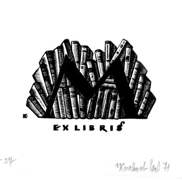
The semantic aspect, alongside imagery, is one of the starting points in developing a calligraphic composition. Letters and their combinations can create symbolic or allegorical images indicating the character and identity of the owner. Yet the emotional tone of the composition must remain within the framework of its plastic concept and figurative construction. The colour and texture of the writing emphasise and reinforce its artistic expressiveness. One sphere of activity of the lettering artist is the typographic ex libris-the least studied area of bookplate art. To a certain extent, an ex libris bears the imprint of the taste, style, and erudition of both its creator and its owner. Like a mirror, it reflects the spirit of its time, artistic aspirations, and the technical possibilities of its execution. Contact with the art of the ex libris requires erudition, knowledge, and an understanding of the genre.
The modern typographic ex libris remains an impulsive carrier of information, an active conduit of contemporary culture and art, and a form of study and research.
In order to analyse the emergence and formation of the typographic ex libris as a creation of the calligrapher-artist, it is necessary once again to return to its history and carefully trace its development, which is inevitably connected with social phenomena, traditions, and the creative work of its creator-the artist.
The art of the ex libris originated in the Middle Ages and has travelled a centuries-long path. Germany is traditionally regarded as the birthplace of the bookplate, where from ancient times there existed a custom of marking valuable objects belonging to their owner.
In the distant era of the Middle Ages, inscriptions in books usually began with the words Ex libris, which in Latin mean “from the books”. They were followed by the name and surname of the book’s owner and the name of the library or monastery. Books were of great value in those times, and the owners of libraries-such as major feudal lords, wealthy merchants, or monasteries-marked them with their sign. This helped protect collections from theft. The expression “ex libris” predominates on bookplates in all countries. On Russian bookplates, besides the expressions “ex libris” and “ex bibliotheca”, one may find the inscriptions “from the books”, “from the collection”, and “from the library”.
The ex libris, together with the book, has travelled a centuries-long path. Throughout its history, the bookplate has managed to reflect complex historical phenomena, ideas, its time, and a gallery of contemporaries. This miniature, as a form of graphic art, contains both documentary and pictorial material. It reveals information about the culture of a particular epoch, its traditions, and the patterns of its development.
The ex libris, serving as a link between the book and its owner, remains a witness to its time. Through the artist’s creative conception, the sign illustrates the owner’s qualities and conveys information about his personality, activities, interests, and the features of his book collection.
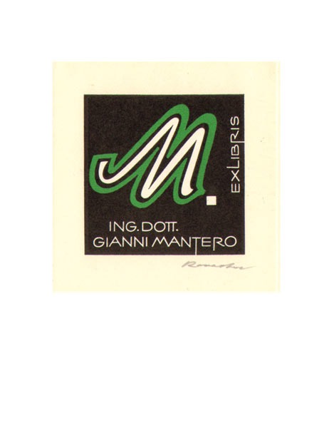
According to their content, ex librises are divided into three types: heraldic, pictorial, and typographic.
1 Heraldic ex librises were subject to certain canons of heraldry. To this day they serve as a means of learning about and studying new coats of arms and contribute to the clarification of genealogy.
2 Pictorial bookplates. The first ex librises generally contained elements of a coat of arms or a monogram within a decorative frame. Subsequently, a pictorial bookplate could consist of a landscape, portrait, interiors, symbolic objects, or scenes revealing particular events in the life of the owner or society.
3 Typographic bookplates, which are divided according to their method of execution into:
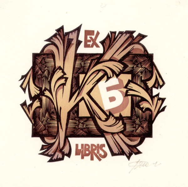
- engraved by an artist or craftsman and printed from the author’s plate. This category also includes old monogram bookplates (from the Polish word “węzeł”—knot), consisting of intertwined initials decorated with lavish frames echoing the ornaments of books and architecture or with decorative garlands;
- written and reproduced by typographic means;
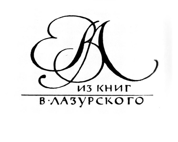
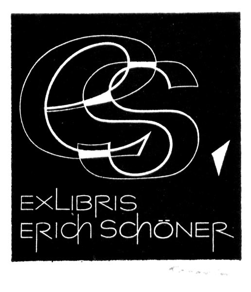
- drawn in the form of monograms (the first letters of the name and surname), in which the drawing is transferred to a lithographic stone or a zincographic cliché;
- composed and printed from type, with the text supplemented by an ornamental vignette, decoration, or occasional ornaments. Typographic ex librises composed from type are distinguished by a simple yet convincing, concise, and constructive composition. The artist does not participate in their production; everything depends on the experience and taste of the typesetter.
According to the method of applying them to a book, ex librises are divided into:
- drawn directly on the book
- an author’s print pasted into the book
- a typographic print pasted into the book
- impressions from a stamp engraved on metal or made as a rubber cast.
The first signs belonged to book copyists, who made written indications of a book’s belonging to a particular person directly in the edition. Later, such indications began to be оформed with vignettes and drawn ornaments.
Drawn ex librises were not widely distributed, since they could serve only small collections. After the appearance of printing and large private libraries, the engraved label replaced the drawn sign. The printed image, executed separately from the book, was pasted onto the inside of the binding, and this became the first prototype of the modern ex libris.
Alongside the printed ex libris, the super-ex libris appeared. This was a coat of arms, a monogram, or an emblem impressed on the outer cover of the binding. Super-ex librises were executed on leather or parchment bindings and, in addition to text, were furnished with artistic images.
The process of creating a calligraphic ex libris is a magical act connected not only with technique and the ability to write, but also with the artist’s capacity to inhabit the image being created. One must find those graphemes and constructions that would, by association, correspond most closely to the owner of the miniature. Restraint and correctness are essential here. Only an experienced master can allow himself a certain calligraphic freedom in expressing his own “I” while writing the bookplate. This naturally depends on his virtuosity, inspiration, and interest in the subject. At the same time, his inner intelligence will not allow him to destroy the connection between creator and client.
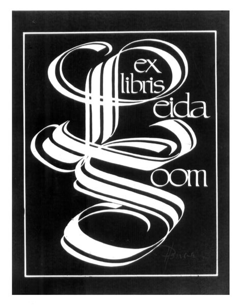
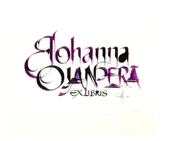
An ex libris is called handwritten when it is executed by hand with any writing instrument: a bird’s or reed pen, a broad-edged or pointed pen, a brush or ruling pen, a wooden stick or ballpoint pen, and so forth. It requires serious training on the part of the calligrapher-artist, both in studying the history of handwritten scripts and in acquiring practical skills.
Ex librises executed with a broad-edged pen are the most popular. In the past, this pen was the principal writing instrument. It gave impetus to the creation of typefaces. A handwritten bookplate creates the impression of a miniature executed easily and quickly, but behind this lies considerable labour and skill: the ability to use a variety of instruments to achieve a particular graphic effect, the ability to choose nibs that diversify the artistic expressiveness of the sign and achieve a closer correspondence between the sign and the owner of the library.
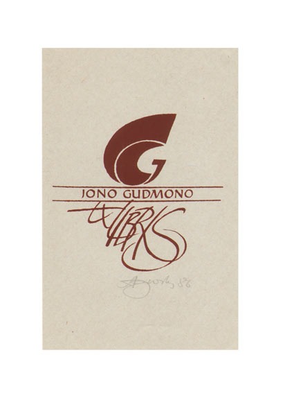
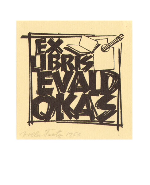
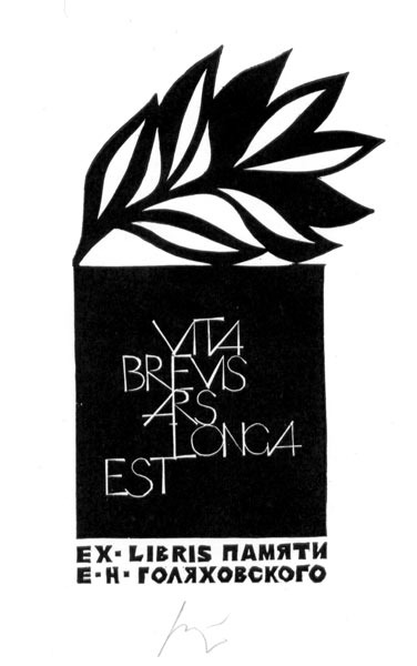
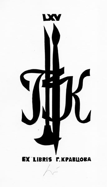
The typographic ex libris reached its flowering in the 1960s, when such masters as R. Raved and O. Feil (Austria), G. Ott and G. Tag (Germany), A. Gurskas and A. Gedeminas (Lithuania), O. Mednis (Latvia), E. Golyakhovsky, G. Kravtsov, and G. Ratner (Russia), V. Toots and P. Luhtein (Estonia) turned to it.
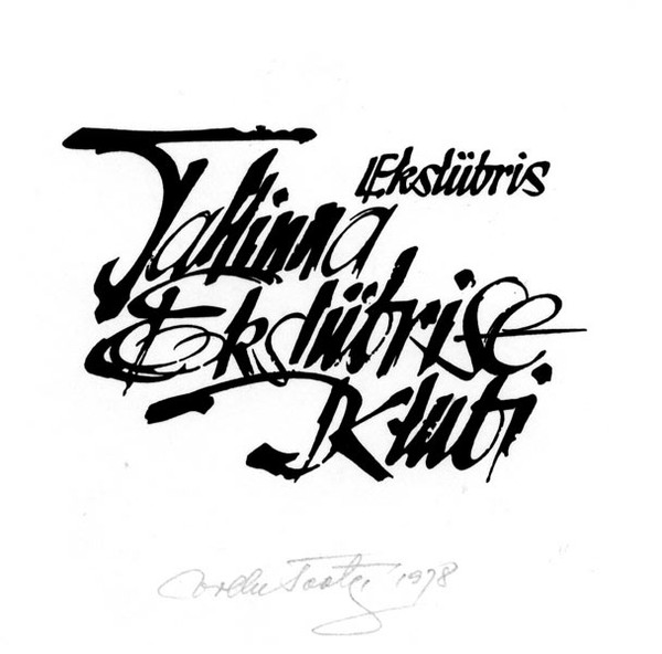
The schools established by Villu Toots in Tallinn and Albertas Gurskas in Vilnius exerted an enormous influence on the calligraphic ex libris. The traditions of calligraphy began to revive. The art of beautiful writing had always been carefully passed from master to pupil. At exhibitions, the works of pupils began to appear, greatly influencing new approaches to the typographic bookplate. The ex libris became an object of contemplation. It awakens the imagination, evokes new visual emotions, and introduces us to the owner’s world of character. It began to be perceived as a calligraphic opus, a dedication to a book collector. It may exist as an independent work of art, in which the text represents something more than a mass of calligraphic signs standing one after another.
In modern typographic bookplates, good old calligraphy occupies a proper and prominent place. Time and new approaches to writing have considerably changed the compositional structure and appearance of the graphic miniature. Executed typographic ex librises are becoming more impulsive, emotional, and swift. They convey the pulse, rhythm, and stylistics of their time.
Among the virtuoso pupils are Algis Klishyavichus and Mindaugas Petrulis-from the school of A. Gurskas; Heino Kivihall, Sven Keerus, and Leo Kittask-from the school of V. Toots. A special place in calligraphic ex libris belongs to Hannu Paalasmaa, a pupil-as he considers himself-of V. Toots. This lettering artist from Finland created portrait ex librises, based on traditional calligraphy, for many figures of culture and art. The grapheme of his letters is refined, correct, and pure. The form and colour of the type correspond to the image of the owner of the bookplate. The background may be calm or impulsive. This master occupies a special place, since he managed to create more than four hundred typographic bookplates in his own manner and technique.
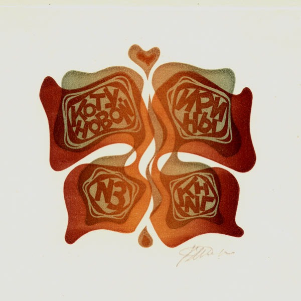
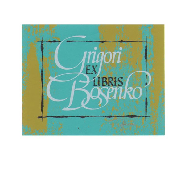
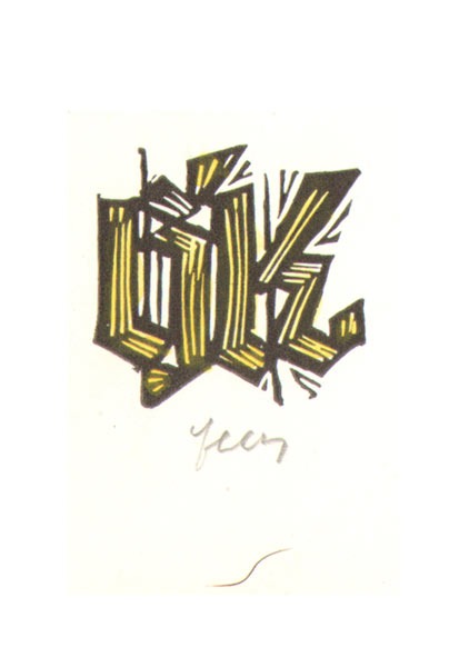
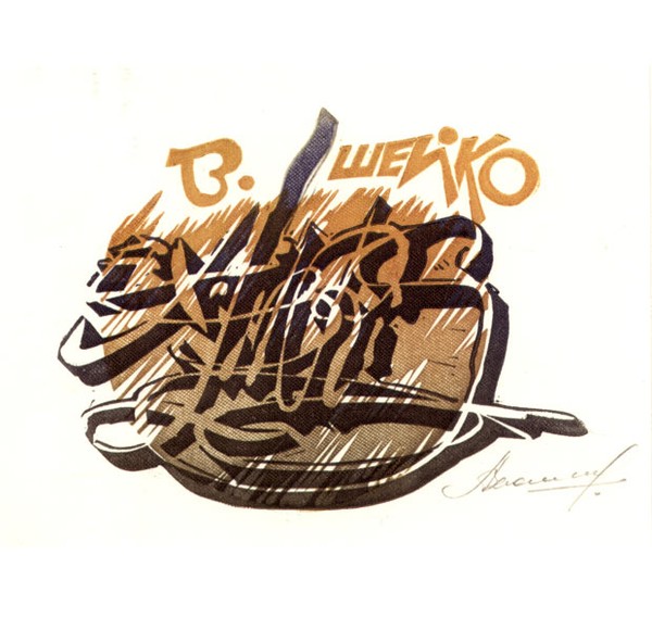
In Moldova, the art of the typographic bookplate began to emerge in the 1970s. The stimulus was provided by republican and international ex libris exhibitions and competitions. Clients for typographic bookplates began to appear considerably later. By that time, typographic opuses had already been created by the artists Ilya Bogdesko and Alexei Kolybnyak. The culture of lettering captivated Grigory Bosenko, and subsequently his pupils Andrei Vasiliev, Valery Hertz, and Vladimir Sheiko. They began to develop typographic ex librises constantly. Characteristically, they executed the signs on linoleum, while A. Vasiliev and V. Sheiko used several “blocks”, that is, produced them in colour. The typographic bookplates of Moldovan artists began to appear increasingly often at exhibitions of various levels.
Thus, in October 1982, the first exhibition of typographic ex libris was held in Chisinau, presenting 230 works by 72 artists. In the 1980s, about twenty artists in the republic were already engaged in typographic ex libris. At the art institute, students began producing calligraphic bookplates as part of the curriculum. It was no accident that some artists began to specialise exclusively in typographic bookplates. They were written or drawn and reproduced by typographic means. With the general decline of interest in the bookplate, interest in the typographic ex libris began to disappear first of all in the 1990s. Today, only G. Bosenko is actively engaged in it in the republic.
The revitalisation of the contemporary ex libris movement, discussions about the place and role of the bookplate, and continuity will produce positive results and make it possible to develop the typographic bookplate in a new capacity.