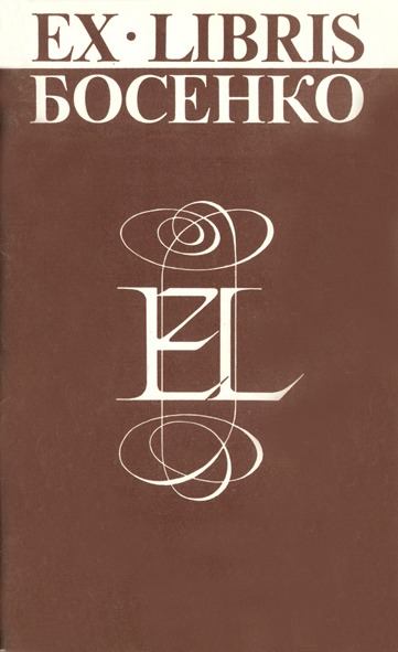
The aim of this exhibition is to acquaint lovers of graphic art with the work of Grigory Nikolayevich Bosenko, a representative of a comparatively new field of graphic art in our republic-small-scale graphic art, and in particular the bookplate as one of its forms-to which the artist has devoted fifteen years of his activity.
Grigory Nikolayevich Bosenko was born in 1947 in the town of Kiliya, Odesa Region. In 1972 he graduated from the architectural department of the S. Lazo Chisinau Polytechnic Institute. In ten years of work in the field of architecture, G. Bosenko managed to accomplish much, and the result of this labour was that in 1977 he was awarded the title of laureate of the All-Union Review-Competition of Young Architects’ Work for the project of the building of the Yalsveny Scientific and Production Association Institute and the design of the interiors of the administrative building of the Central Committee of the Communist Party of Moldova.
While working as an architect and teaching the fundamentals of architecture at the S. Lazo Chisinau Polytechnic Institute, G. Bosenko turned to graphic art, more precisely to its small forms, while at the same time devoting considerable attention to posters and to the artistic design of printed publications. He is a member of the USSR Union of Artists and the USSR Union of Architects, and chairman of the bookplate section of the republican board of the Voluntary Society of Book Lovers of the Moldavian SSR.
Having become seriously interested in bookplates in 1971, G. Bosenko made them not only the principal direction of his work, but also an object of promotion. Joining the bookplate section in 1976 and subsequently heading it in 1979, he became a kind of “missionary” of small-scale graphic art and the bookplate. His numerous articles, posters, and catalogues devoted to bookplate exhibitions, as well as a series of booklets on bookplates and book graphics published by the Voluntary Society of Book Lovers of the Moldavian SSR, made a weighty contribution to the development of applied graphic art. The most interesting work in this field was the miniature collection he prepared, Masters of the Moldavian Bookplate (Timpul, 1983), which brought together the finest works of Moldavian bookplate artists. The bookplates of Grigory Nikolayevich Bosenko have been exhibited at many republican, as well as all-Union and international exhibitions, becoming the calling cards of Moldavian graphic art in Moscow, Tallinn, Vilnius, Minsk, the GDR, Hungary, Yugoslavia, Switzerland, Denmark, France, Belgium... Not always prizes, but recognition everywhere.
In the field of small-scale graphic art, the artist works not only with bookplates but also with its other forms, for example PF (an abbreviation of the French pour féliciter-to congratulate), which represents a kind of New Year’s dedication. The PF of 1985, executed in the technique of etching, deserves the greatest attention in this field. The sailing ship depicted on it, racing over the waves, seems to symbolise the artist’s voyage into the uncharted ocean of the future.
The themes and techniques of the graphic artist’s works are varied. He is constantly experimenting, seeking new forms of technical execution and at times achieving astonishing results. He has created more than one hundred bookplates, but we shall dwell only on those that are complete works.
At the exhibition “The Tree in All Its Aspects,” held in France, one of the most successful works G. Bosenko created for this event was the bookplate for K. Rodel, presenting the tree as a symbol of life, whose inseparable companions are despair and joy-the gallows and the swing. The aquatint technique enabled the author to create a deep, velvety tone that disposes one to reflect on life and its values.
It must be said that into almost all his bookplates, whether a work dedicated to an exhibition or addressed to a particular person, the artist puts his own attitude, a part of his soul. Thus, in the miniature created for the 20th International Bookplate Congress “Weimar-84,” held in Schiller’s homeland, alongside the portrait of the great poet-the prescribed theme-the artist depicts a small ship bearing his monogram, leaning slightly but nevertheless proceeding under full sail.
In some works a scenographic conventionality appears, a kind of one-actor, one-spectator theatre. Life-a theatre?! This might be the title of the bookplate for Luc Van den Briele, depicting a stage, a curtain in the form of thickets of trees, as if embodying earthly existence, a mechanism that “turns” life, and a man-a traveller trying to look ahead and lift the curtain of life.
G. Bosenko devoted several more works to the theme of theatre and writers, the most successful of which was another bookplate for Luc Van den Briele-on theatrical productions of Chekhov’s works. The artist constructs it according to the principle of theatrical stage design, using, like contemporary scenographic artists, various associative elements. Through detailed development of a heap of “junk,” the author seeks to translate into the language of associative graphics the petty cares, trivial bustle, and even the “junk” of life observed by A. P. Chekhov.
The artist also created successful works for an exhibition on music and musicians held in the FRG. The sheets “Ex musicis Sholda” and “Prisyazhnyuk Phonotheque,” depicting musical instruments, are executed in the technique of colour zincography, the delicate colour transitions of which the artist interprets as modulations of melodies, as the sound of instruments. The bookplate for Bul, dedicated to Bach, is resolved in an entirely different key. The technique of engraving on plexiglass enabled the artist, who has an excellent sense of the relationship of masses, to create a composition that is architectonically interesting and rhythmically harmonious. The clear verticals of the organ pipes seem to encompass the sounding space and Bach’s portrait. A certain flatness inherent in this type of technique did not prevent the author from giving the composition multiple planes. The effect of multiple planes arises through the juxtaposition of patches of different luminosity: the sparse background rendered in strokes, the dark volumes of the organ pipes, and the light portrait of the composer.
G. Bosenko repeatedly turns to the work of artists. He seems to “try on” their perceptions of the world, studies their works, selecting in the process of reflection precious grains of their experience.
The bookplate for Aino Lepik is perceived as an appeal to antiquity. Its semantic and compositional centre is the statue of the Nike of Samothrace, entwined with architectural structures reminiscent of restoration scaffolding, as well as with a “web of antiquity” created by the finest needle strokes.
At the exhibition in memory of Albrecht Dürer, held in his native city of Nuremberg, G. Bosenko presented two undoubtedly successful works. One of them is the bookplate for V. Sheiko. The composition of Dürer’s monogram and the “Portrait of a Young Man,” one of the master’s masterpieces, enclosed within it, is built on the combination of light letters of “Renaissance roman type” with the dark patch of the portrait. In the other work-the bookplate for Lupu-Dürer’s famous “magic square” is presented, containing a mirror with the reflection of the artist’s “Self-Portrait.” It should be noted that both engravings, executed in the spirit of Dürer’s engraving traditions, are technically flawless.
G. Bosenko’s miniatures are often perceived as a carefully conceived and jeweller-like constructed performance, in which everything-the unconditional nature of genuine forms and the conventionality of their interrelations-serves to create an image-metaphor. The bookplate for the talented Lithuanian architect Stasyulis may serve as an example.
G. Bosenko timed one of his bookplates to an exhibition of works by the remarkable Finnish graphic artist and calligrapher Paalasmaa; in it, two figures in medieval dress-an Englishman and a Frenchman, one with a brush and the other with a pen in hand-embody the long-standing traditions of the art of calligraphy, to which Paalasmaa devoted his work.
Grigory Bosenko devotes considerable attention to the typographic bookplate. The art of calligraphy presents type not as an arrangement of letters but as living lines, in which letters, thanks to the artist’s skill, form images and evoke various associations and sensations. The bookplates dedicated to the memory of Aivazovsky are variations on the theme of the sea. In the bookplate for Klaus Rodel, executed in the technique of screen printing, the artist composes the letters so masterfully that they form distinctive calligrams: before us arise now a stormy sea, now a small ship lost in the waves, now the masts of a sailing vessel. The plasticity of the type, the varying thickness of the strokes, and the flawless lines give rise to a true seascape.
Working with classical typefaces, G. Bosenko makes them sound differently each time. In Paalasmaa’s bookplate, taking the classical Roman type as a basis, the artist achieves a particular elegance, harmony-one might say, the artistry-of the type through a greater inclination of the thin strokes of the letters. The decorative curls not only do not disrupt the strict rhythm of the type, but complement it, introducing a special nuance of the artist’s own attitude to the works of such an excellent calligrapher as Paalasmaa.
The bookplate for Hanno Lepik, executed in the technique of screen printing, is one of G. Bosenko’s most successful typographic marks. The letters are not constructed, but written with a resilient, bold line. It seems that the artist seeks to preserve the sense of swift, light work and achieves a complex, dynamic integrity of composition.
Most often G. Bosenko creates his own type, in which all the fundamental principles of calligraphy are reflected: clarity, beauty, character, simplicity, originality, proportionality, unity, refinement, freedom...
The typefaces of G. Bosenko’s bookplates are varied and often unexpected in their design. Thus, in the bookplate for Kuris, executed in the technique of letterpress printing, the artist achieves the effect of congref-relief embossing of letters-through the use of stretched damp paper. The bookplate for Gudmonas Ionas is executed in the same technique. The expressiveness of the composition is built on the considered union of contrasting lines: a free type adorned with flourishes and a strict lower inscription.
In general, the artist often uses the phenomenon of contrast, caused not simply by the difference of elements but by their polarity, thereby achieving dynamism of forms and more vividly emphasising their individual properties. By constructing contrast through the opposition of colours, textures, and principles of mark construction, he gives his miniatures a particularly expressive resonance.
The bookplate for Klaus Rodel is also of interest as a kind of variation on the theme of a bookplate about the bookplate. The typographic composition, executed with a broad-nib pen, is extraordinarily beautiful and dynamic. The movement, gradually increasing, unfolds from top to bottom. The living, mobile lines of the type, written in a free, painterly manner, end below with a laconic, strict rendering of the owner’s name. This device likewise creates G. Bosenko’s distinctive authorial handwriting.
One of the graphic artist’s latest typographic bookplates-the bookplate “Bosenko’s Book Collection,” belonging to the artist’s father-was an unquestionable success. The character of the type in this mark returns us to the handwritten books of folk craftsmen-calligraphers. The text of the ancient saying, “The Cossack line shall never perish,” with miniature images of the Cossack host and the singer Mamay interwoven into it, organically merging, is rooted in Ukrainian folklore.
One cannot fail to mention G. Bosenko’s works in the field of the children’s bookplate. The artist devoted more than ten opuses to children, most of them executed in the technique of engraving on plastic and plexiglass, several in etching. One of the best may be considered the mark “This Book Belongs to the Boy Pavlik” (1973), in which seven fairy-tale gnomes walk across a little bridge laid over books.
Increasingly, bookplates executed in the technique of etching become not so much the property of books from collections as self-sufficient graphic miniatures. His opuses are distinguished by the complexity of their technical methods, which presupposes painstaking labour. He often uses etching with three or more bites, the aquatint technique, and a combination of etching and burin.
The philosophical depth of G. Bosenko’s bookplates and PFs, the “theatricality” of his vision, and his rich creative imagination should be noted. The motif of stairways and sails, repeatedly found in his works, seems to personify movement-forward and, undoubtedly, towards the better. Such a movement may be considered his turn to book graphics and book design. The artist’s latest works in this field concern the design of children’s books. Both in book miniatures and in the design of publications for young readers, the graphic artist enters into children’s interests, vision, and imagination. He designed I. Georgitse’s book Wild Strawberry with interesting playful illustrations and typographic cut-paper compositions that enliven the text.
Speaking of the creative path of Grigory Nikolayevich Bosenko, a path full of searches, one wishes to note his constant striving for the new, for the improvement of his mastery, his enormous capacity for work and industriousness, which serve as a pledge of the artist’s further creative growth.